PR GIFT
context
After a rebrand, a baking supply retailer needed to introduce its new logo and help people remember it. A gift mailing to bloggers was planned as part of the campaign.
my role
Gift idea, “One shape, different associations” concept, coil shape and visual design, packaging design, copy, and unboxing experience. The logo had been created before my involvement.
task
Create an unexpected, useful gift that draws attention to the new logo, inspires unboxing content, and stays in use after the first reveal.
idea — one shape, different associations
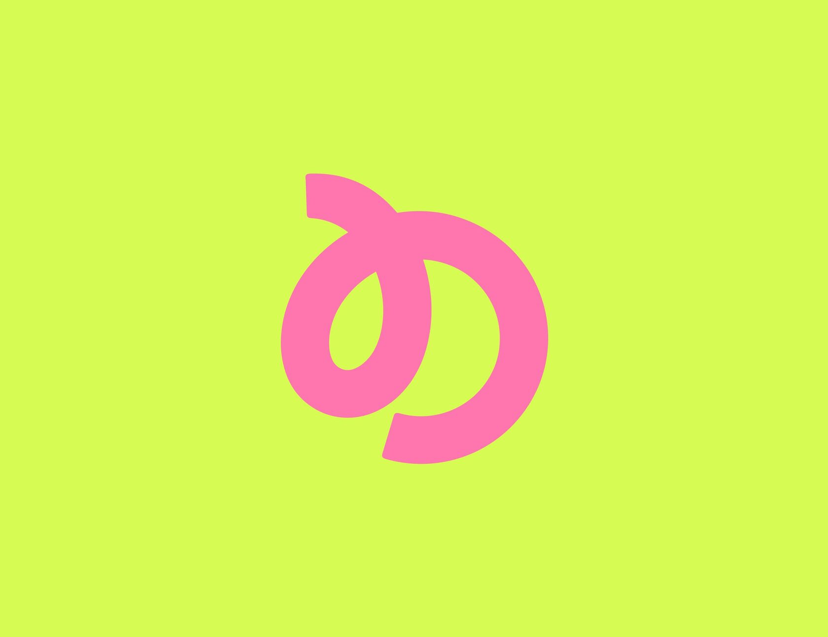
We first considered merchandise with the logo printed on it, such as a water bottle. I suggested turning the logo itself into an object.
This led to the idea “One shape, different associations”: the logo could resemble a swirl of cream, a croissant, or something entirely different.
how the mosquito coil idea took shape
It was May, when the holidays in Russia bring barbecues and trips outdoors. People spend their evenings outside, where mosquitoes can spoil the experience.
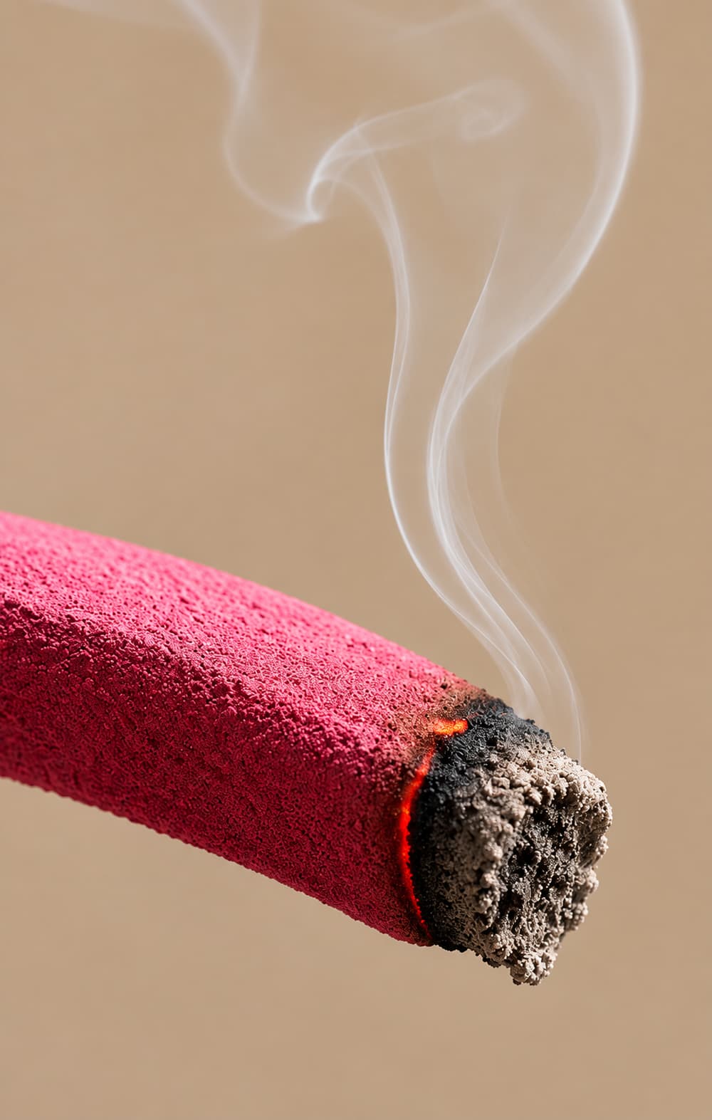
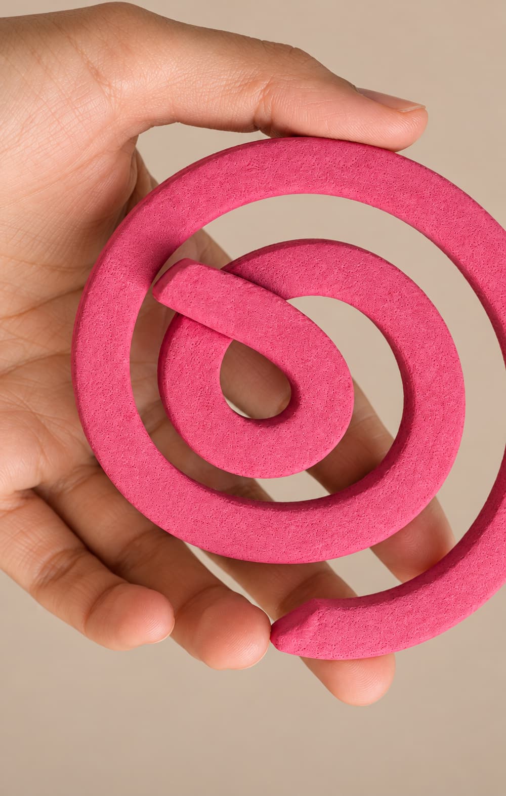
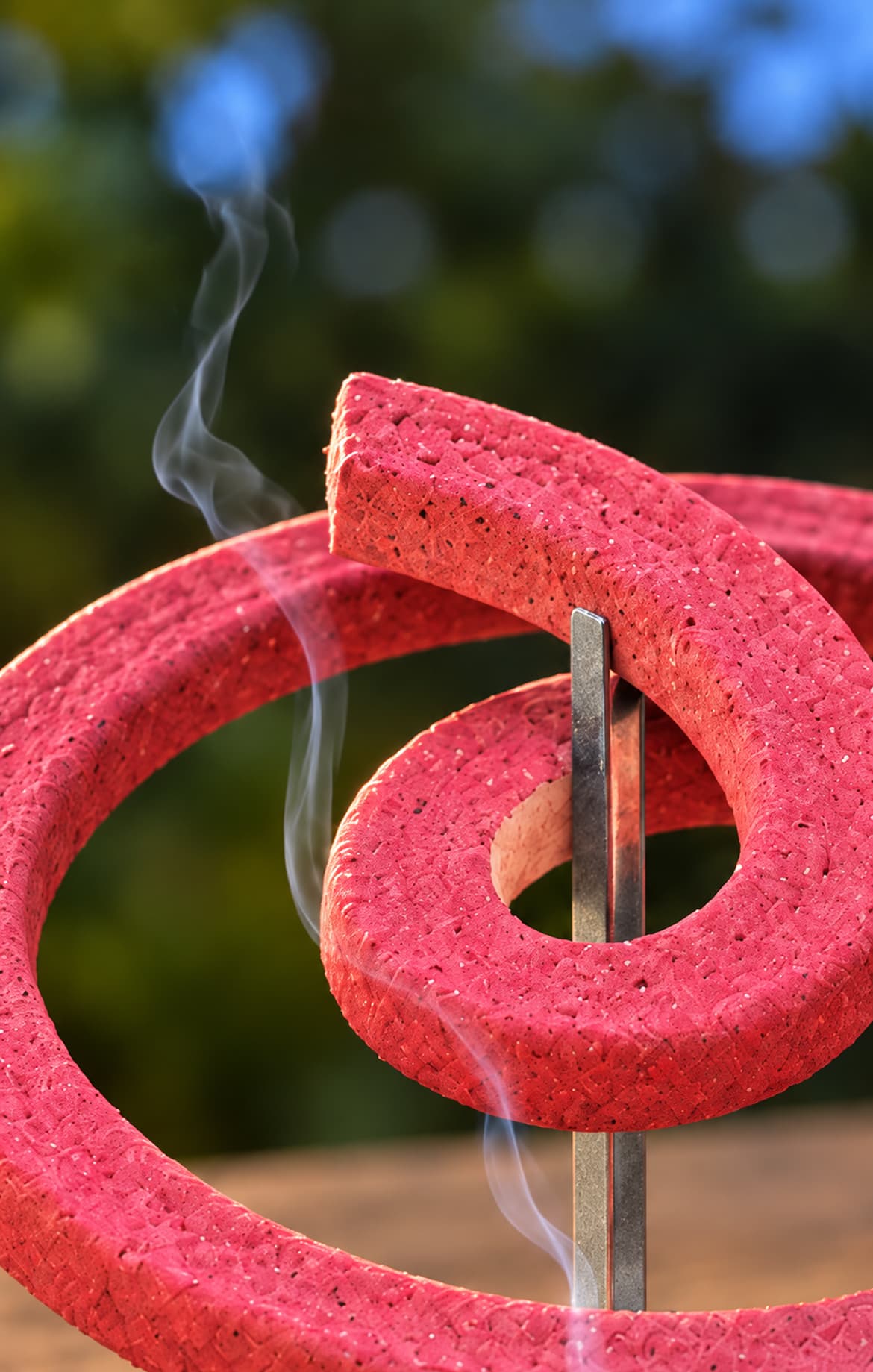
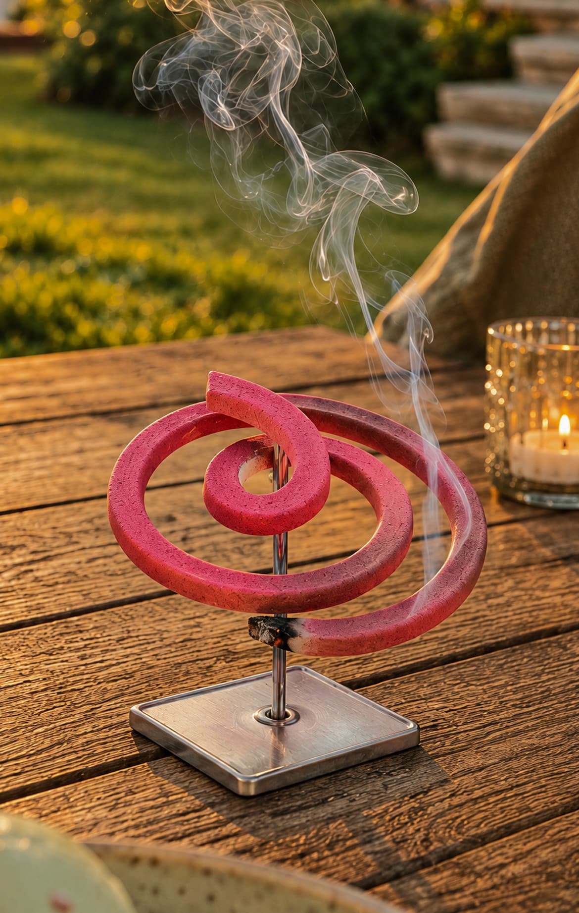
By connecting the logo’s shape with the season and this everyday need, I came up with a mosquito coil — a useful object shaped like the new brand mark.
solution — light up the logo
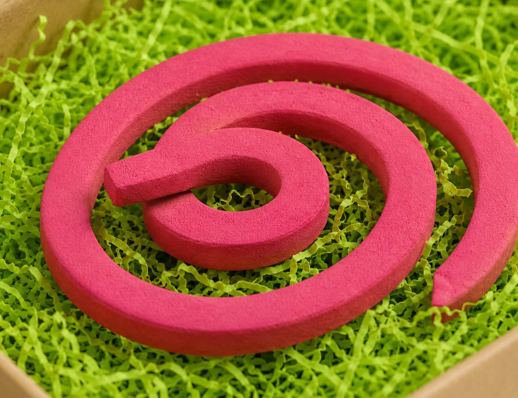
The coil follows the shape of the logo and comes in the brand’s signature pink. Used outdoors, it keeps the logo in view while people relax.
Its practical purpose gives people a reason to use the gift, while its unusual shape gives them a reason to show it to others. I created the tagline “Light up the logo” for the gift.
an unexpected gift from a baking supply brand
Instead of the usual aprons and baking tools, I proposed a gift for time away from work. It is an unexpected choice for a baking supply retailer — which gives people a reason to take an interest and talk about it.
The logo’s shape and signature colour keep the connection to the brand clear.
packaging and unboxing
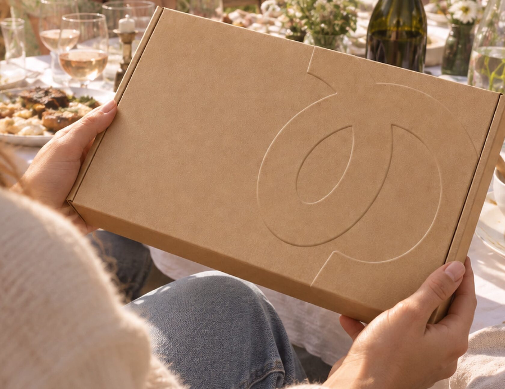
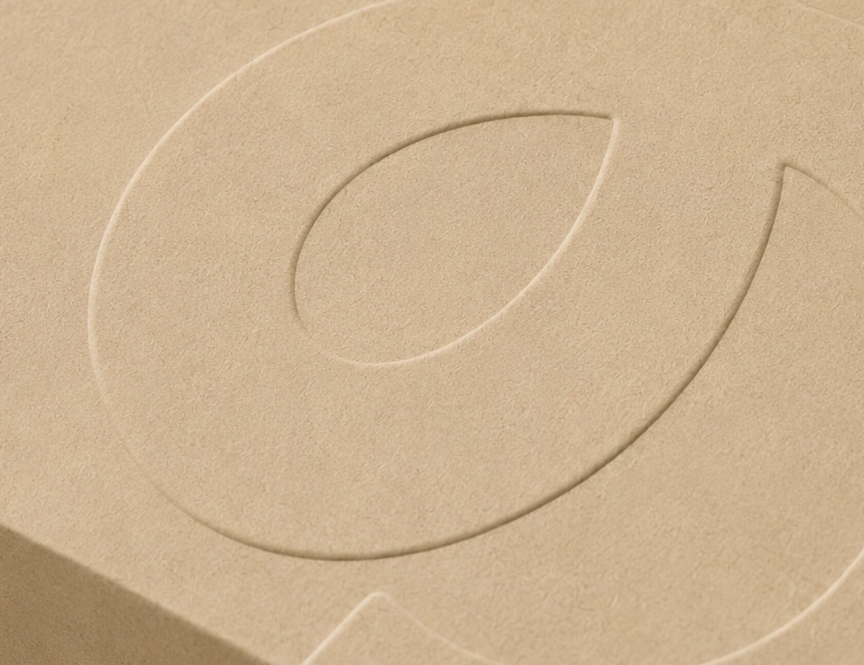
On the outside, a kraft box features a large embossed logo. The simple design creates curiosity without revealing what is inside.
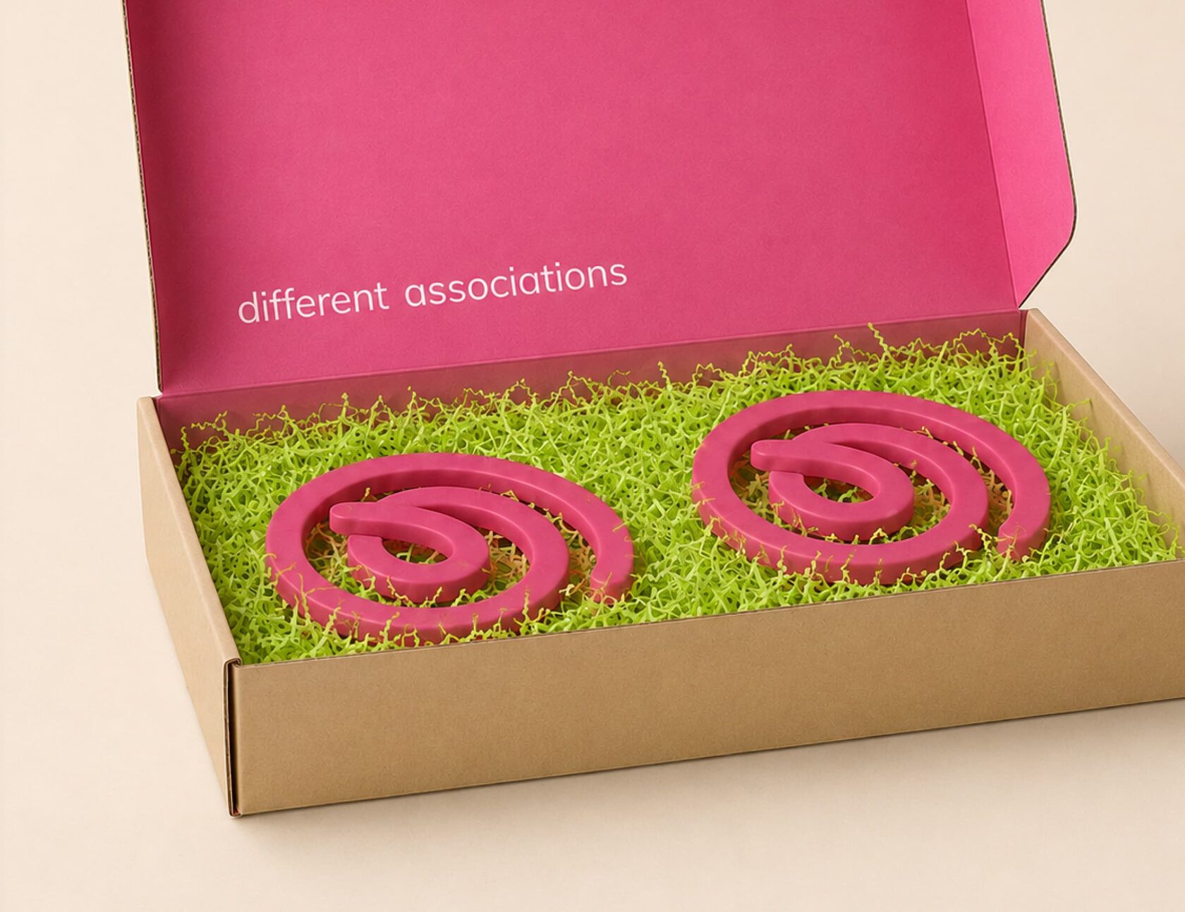
Inside, a bright pink background carries the words “Different associations”. Pink coils sit on green shredded paper. Pink and green are the brand colours, while the paper resembles grass and connects the packaging to the outdoor setting.
The contrast creates a surprise: first, the recipient sees the logo on the box, then discovers an object with the same shape inside.
blogger gift mailing
The plan was to send the gift directly to bloggers, who would film the unboxing and show the coil in use, including during trips outdoors.
Opening the box provides a story for the first video. Using the coil gives them a reason to feature the gift and the brand again.
conversation and sharing
The aim was to spark conversation in the comments: what does the shape remind people of, and why did a baking supply brand choose this object?
Used outdoors, the coil could also catch friends’ attention and start a conversation. The introduction to the new logo would continue beyond the unboxing — through use, social posts, and conversations in person.
status
Unrealised concept. Images are visualisations.
The effects described are intended outcomes.