DOMIK
DOMIK — Russian for “little house,” with a warm, affectionate sense of home.
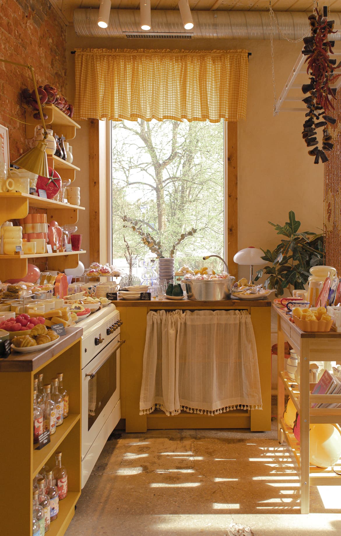
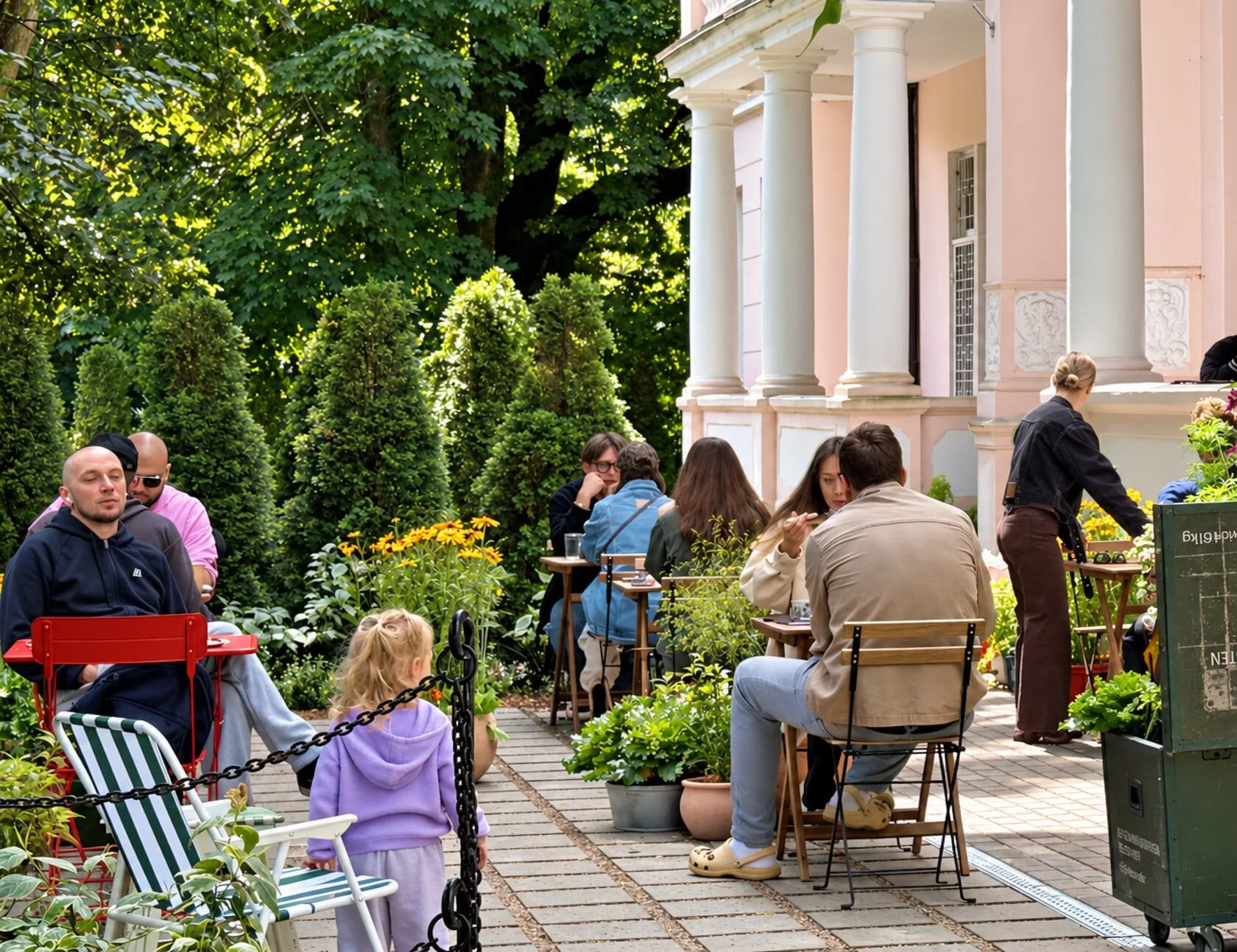
Domik is a café and shop where you can meet friends for coffee, get together with family, and find something for your home or pick out a gift — from vintage pieces to unusual objects and charming little finds.
The name is the starting point for the whole concept: a place where you can be yourself, feel cared for, and find inspiration. Somewhere that feels like your own cosy retreat — comfortable and safe. Childhood memories meet contemporary ideas, and even familiar things can surprise you.
my role
Concept development, visual identity, slogan, design, illustration, art direction for illustrations, and production supervision. I worked with marketing and PR and continued developing the project as lead designer after the opening.
brief
Create a visual identity for the café and shop ahead of its opening. The logo, interior, and overall concept were already in place. My task was to develop the visual style and all brand materials, and work with the marketing and PR on ideas that would help guests discover the brand and connect with its character.
idea
Create a sense of home through simple details: handwritten lettering, loose illustrations, layers of paper, and printing by hand. Make the design feel warm and personal.
solution
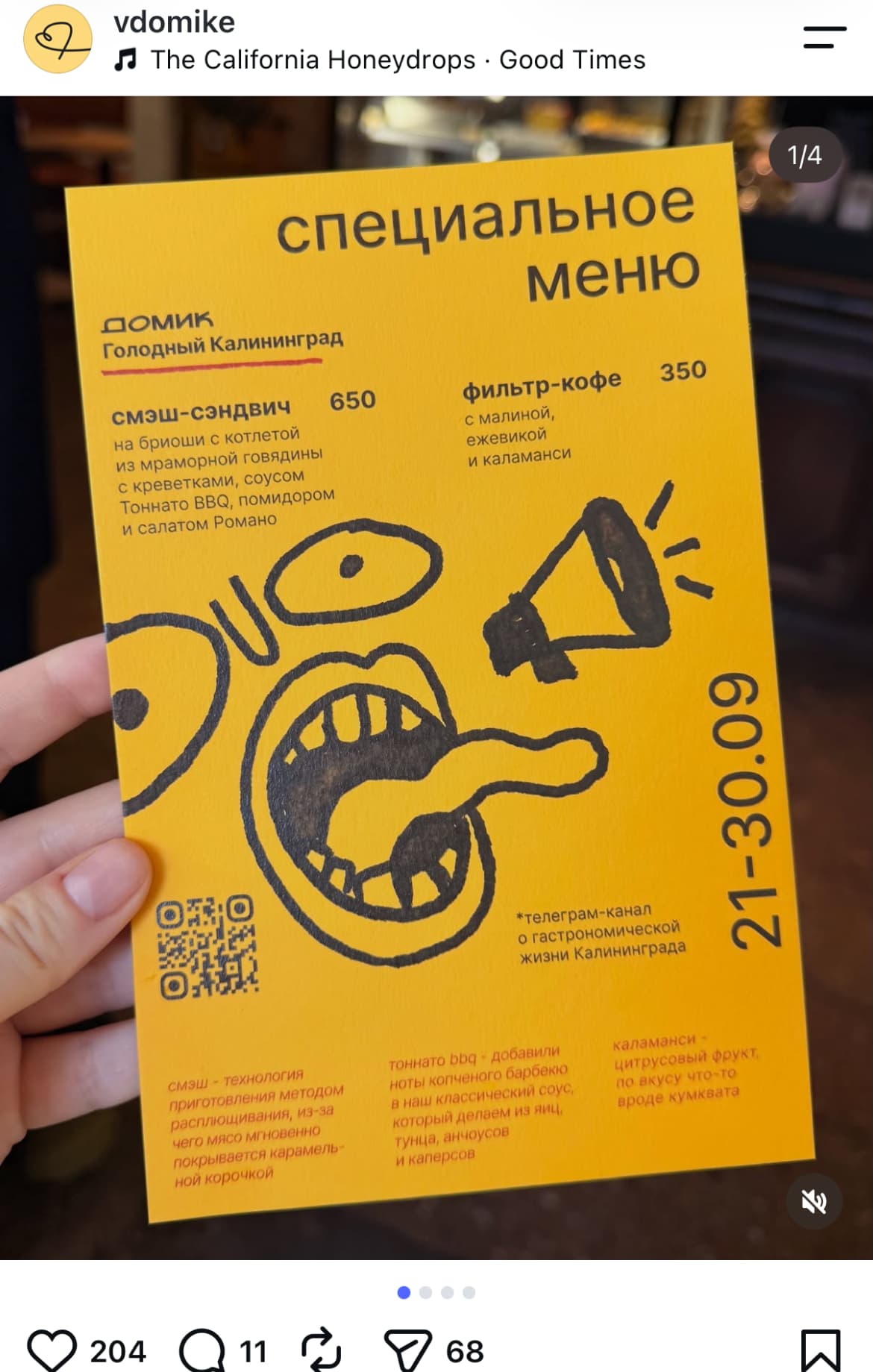
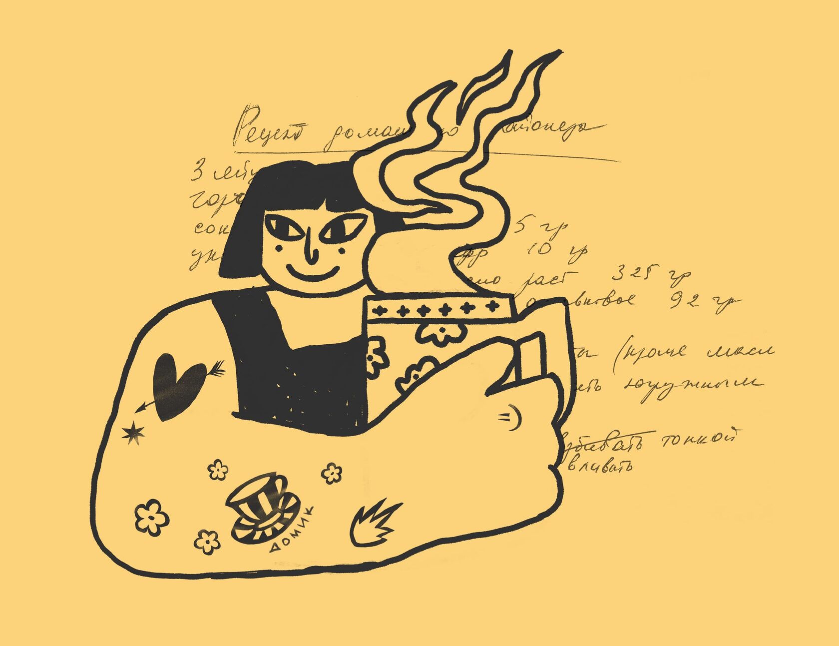
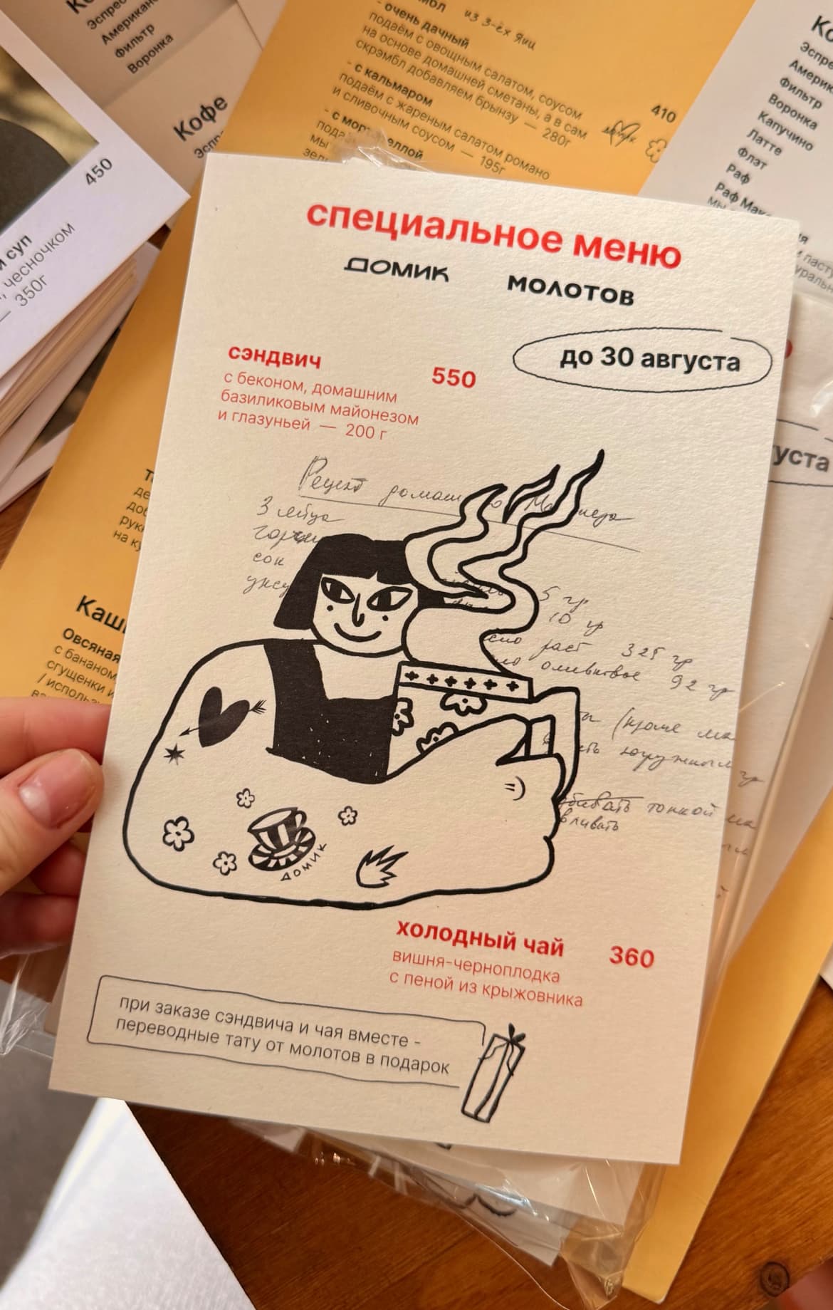
I developed the visual language, the slogan “Я в домике” (“I’m safe here”), and brand materials, including menus, packaging for purchases, staff badges, and a gift certificate. I created illustrations and directed the work of other illustrators. Consistent materials, graphics, and design details brought everything together.
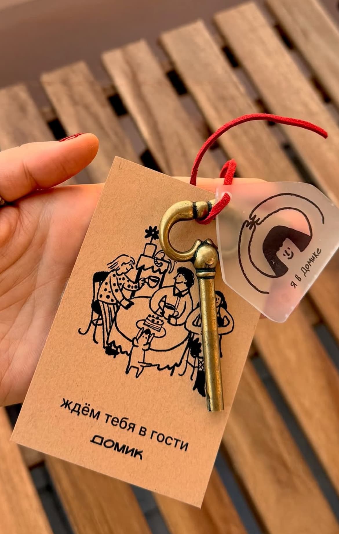
gift certificate — a key
to your own little home
brief
Create a gift certificate for the shop that feels different from a standard gift card and reflects Domik’s concept. It needed to leave the recipient with something they could use and keep as a reminder of the brand.
idea
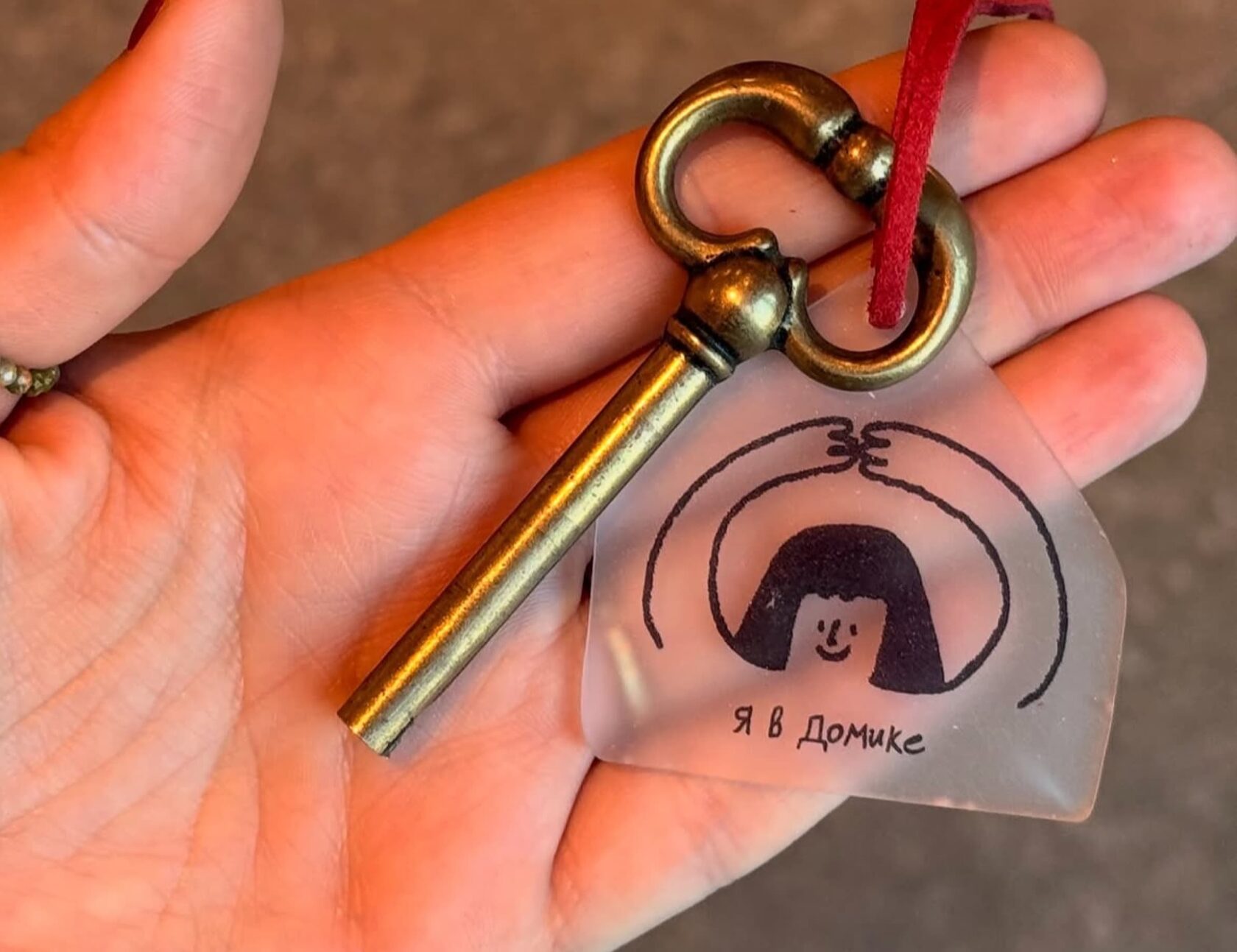
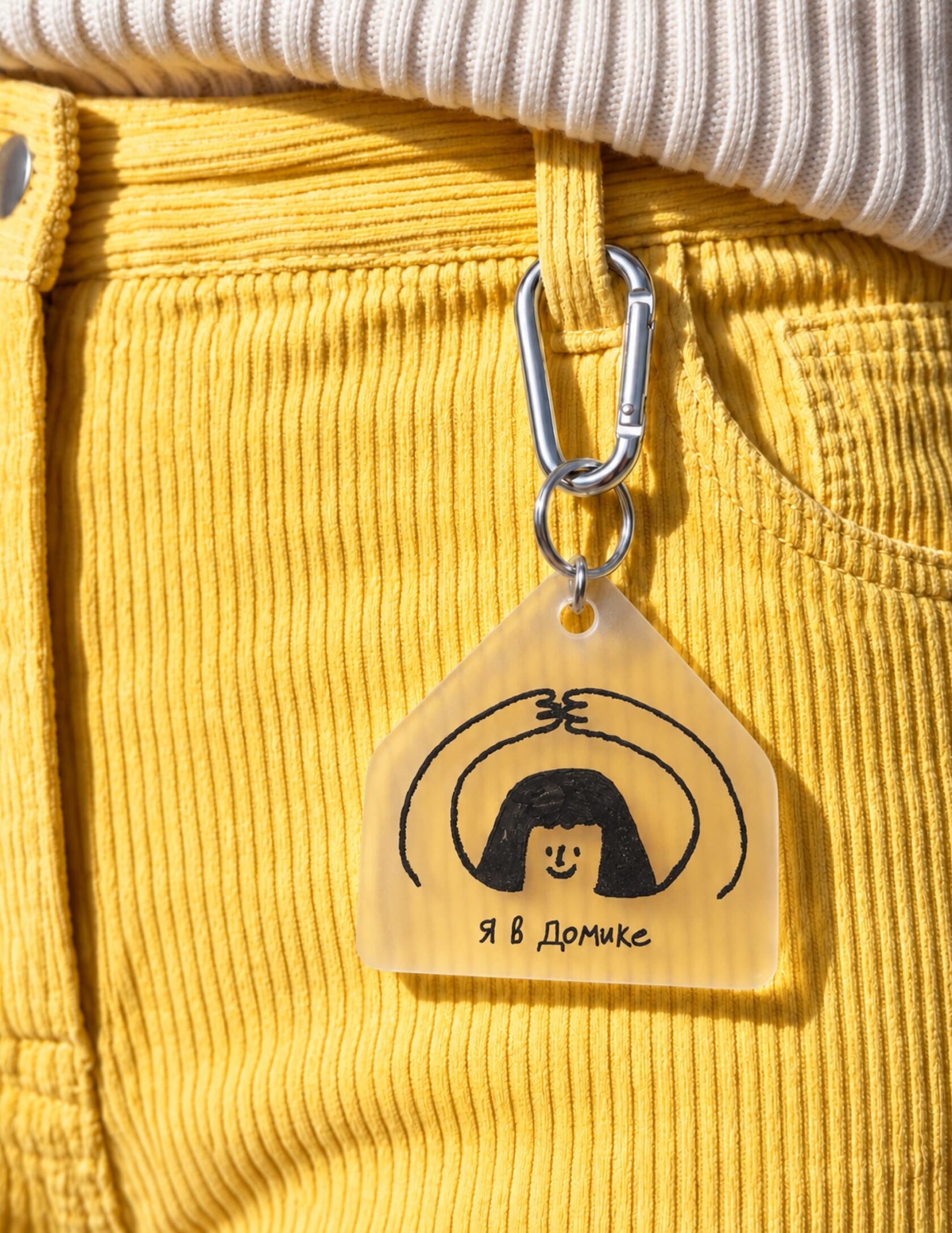
Give someone a key to their own “Domik.” Add a keychain with the slogan “Я в домике” (“I’m safe here”) and an illustration of a familiar gesture from a Russian childhood game of tag: players raise their hands above their heads to form a roof, signalling that they cannot be caught. The reference connects the gift with a feeling of safety, comfort, and calm.
solution
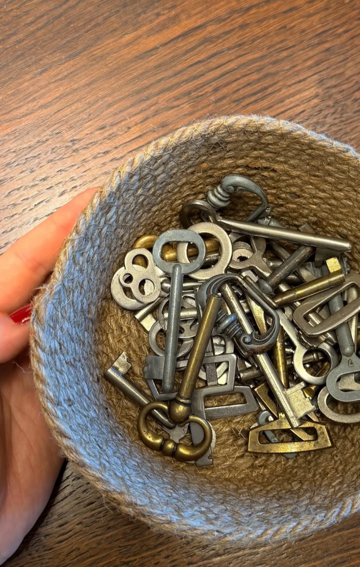
I designed a gift certificate with three parts: a vintage key, an acrylic keychain, and a kraft-paper card. The buyer chooses a key from a basket. The gift amount is written on the back of the card, with space for a personal message.
When the certificate is redeemed, the shop keeps the card and the recipient keeps the keychain. They can also keep the key or return it to the basket for the next customer to choose.
Choosing a key makes the gift more personal. The keychain can be worn on keys or a bag, reminding the owner of Domik and potentially catching other people’s attention.
observation
Customers like the meaning behind the keychain and wear it on their keys and backpacks. Its impact on new visits has not been measured.
fabric menu — a handmade
touch in the interior
brief
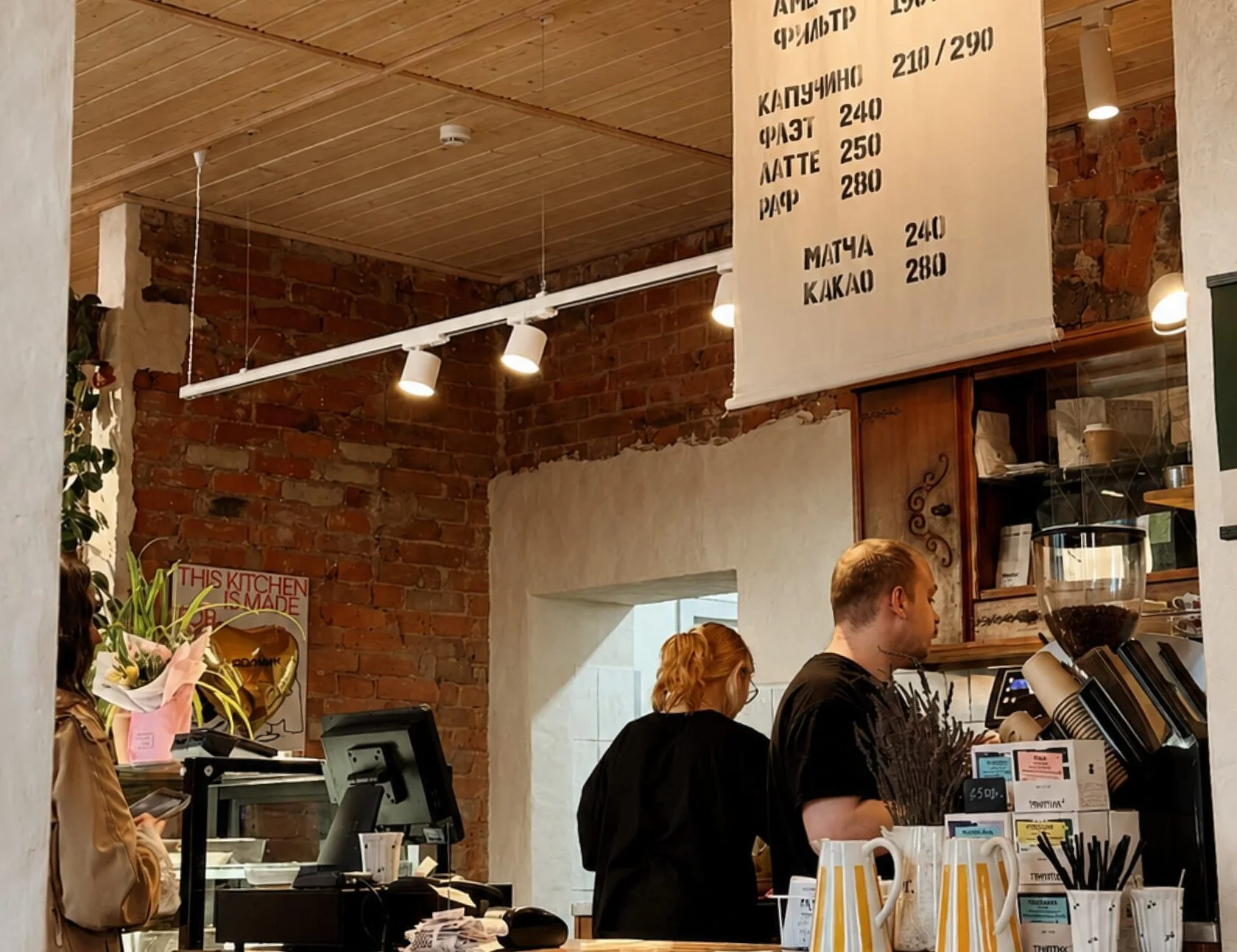
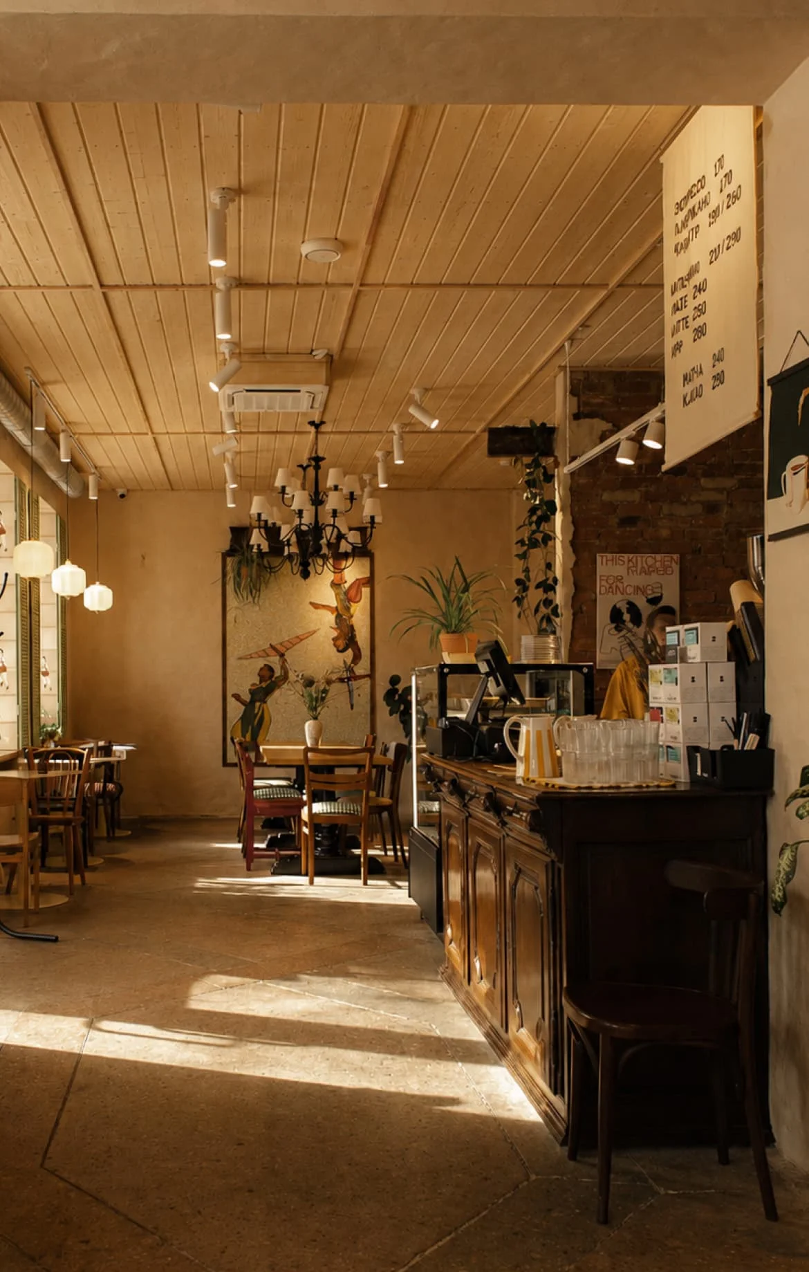
Design a menu of the main drinks to hang above the counter. It needed to be easy to notice, fit the interior, and reflect the venue’s character. Prices and items also needed to be updated without replacing the whole menu.
idea
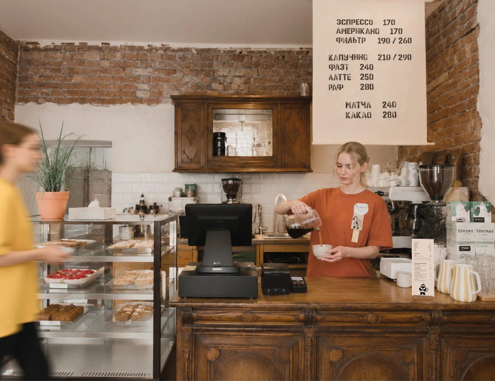
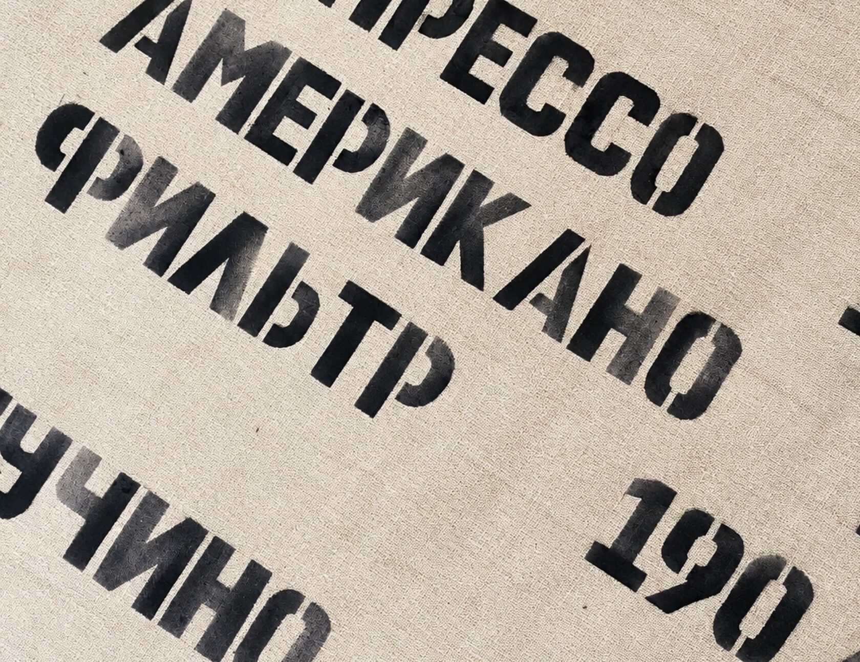
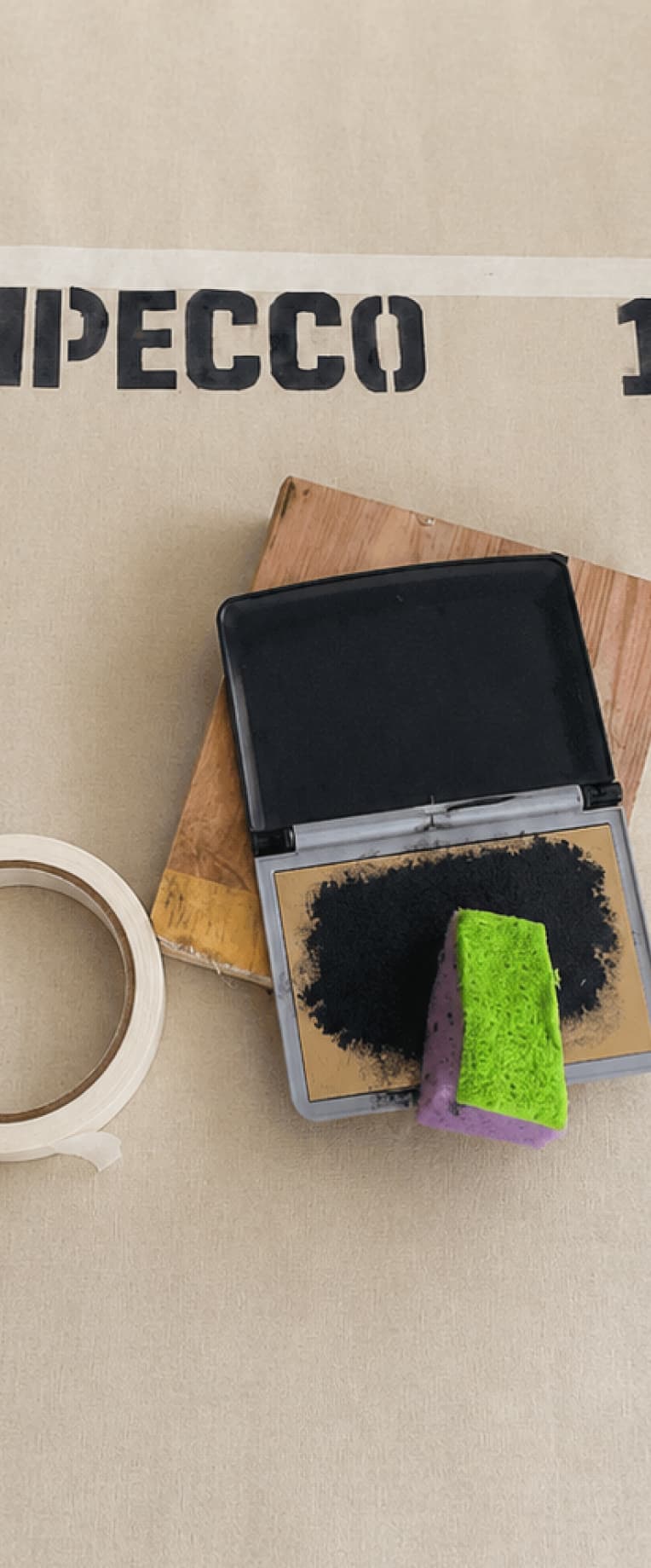
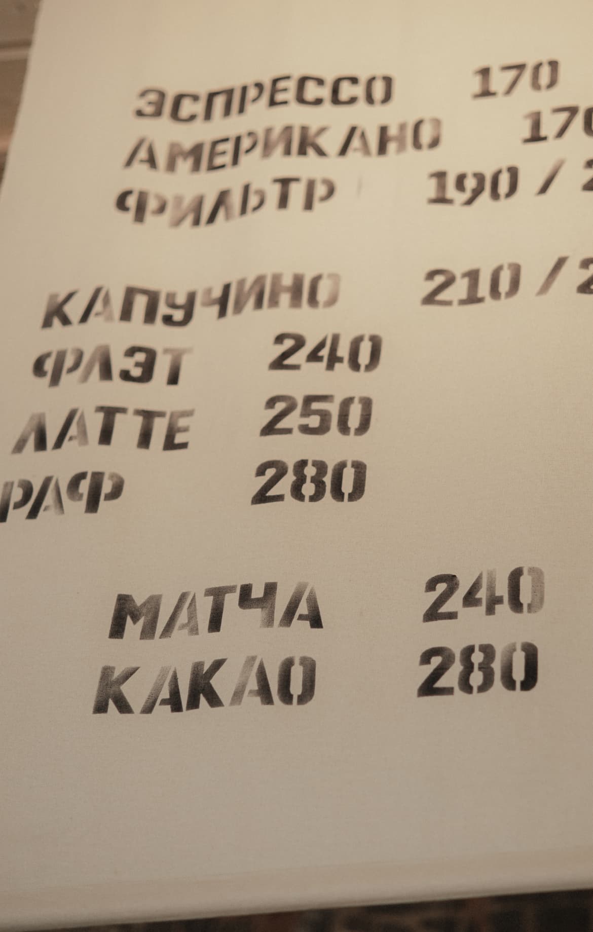
Take inspiration from fabric coffee sacks and their printed lettering. Printing the menu by hand on fabric gives it texture and small imperfections that bring it to life and suit Domik’s warm atmosphere.
solution
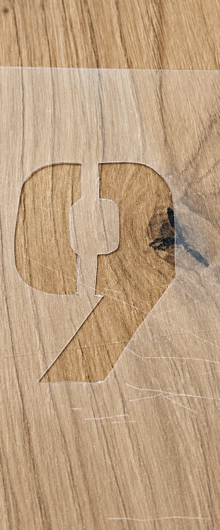
I designed the menu on a large linen panel and supervised the hand-printing process using stencils. The finished panel hangs above the counter as part of the interior.
menu updates
Prices and items can be changed using fabric patches. A new price or name is printed on a small piece of fabric and pinned to the menu. This keeps the main panel in use, while the patches fit naturally into its handmade style.

paper menu, shopping bags
and staff badges
brief
Design the food and drinks menu, packaging for purchases, and staff badges. Give them a consistent style inspired by simple things found at home, with thoughtful details throughout.
idea
Imagine a stack of papers on a table at home: sheets of different sizes, notes, drawings, and handwritten messages held together with clips or staples. Include the handwriting of people who helped create Domik.
graphic elements
I asked the owners, staff, their families and friends to write “Domik” and draw their own little house. I then combined their lettering and drawings into graphic elements used across the brand materials.
solution
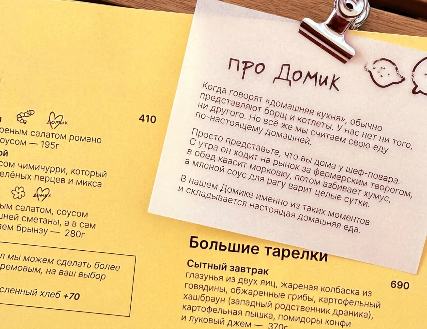
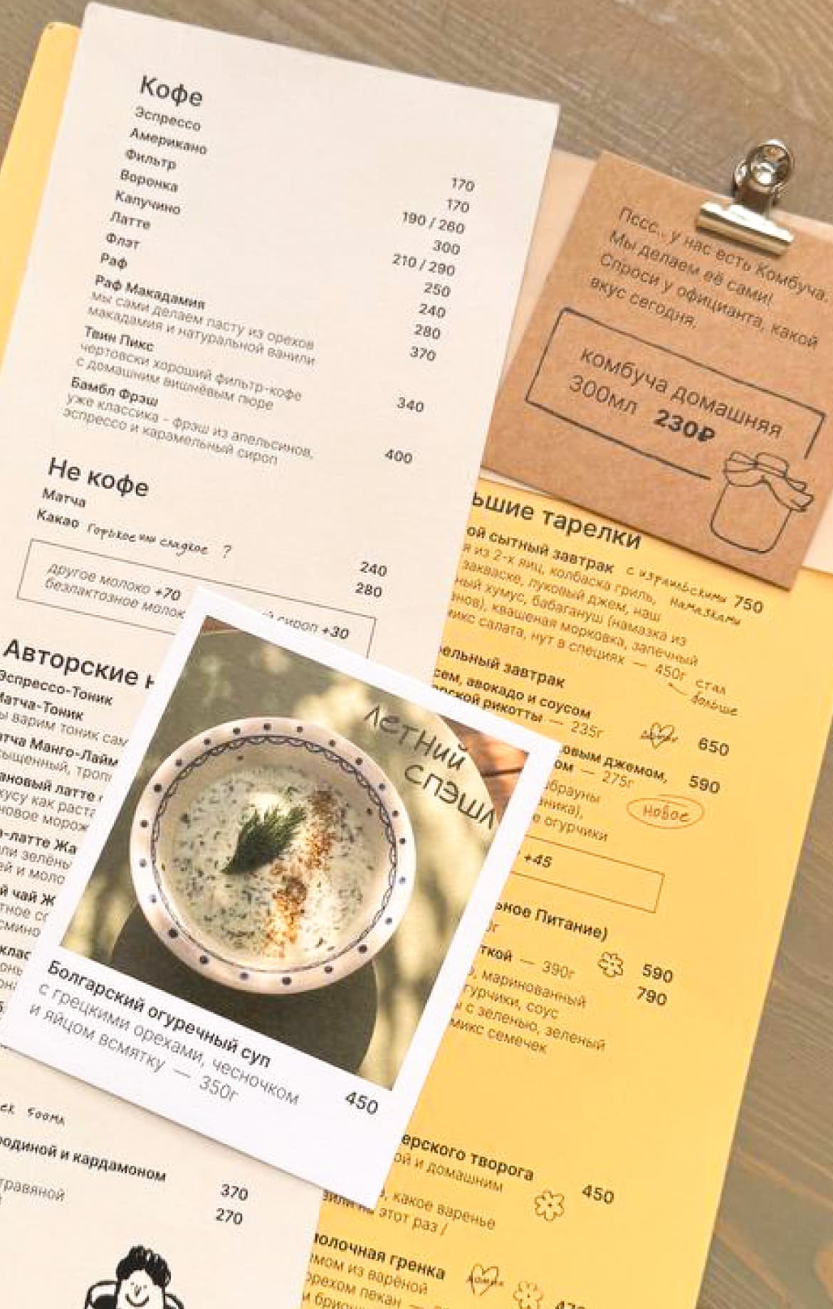
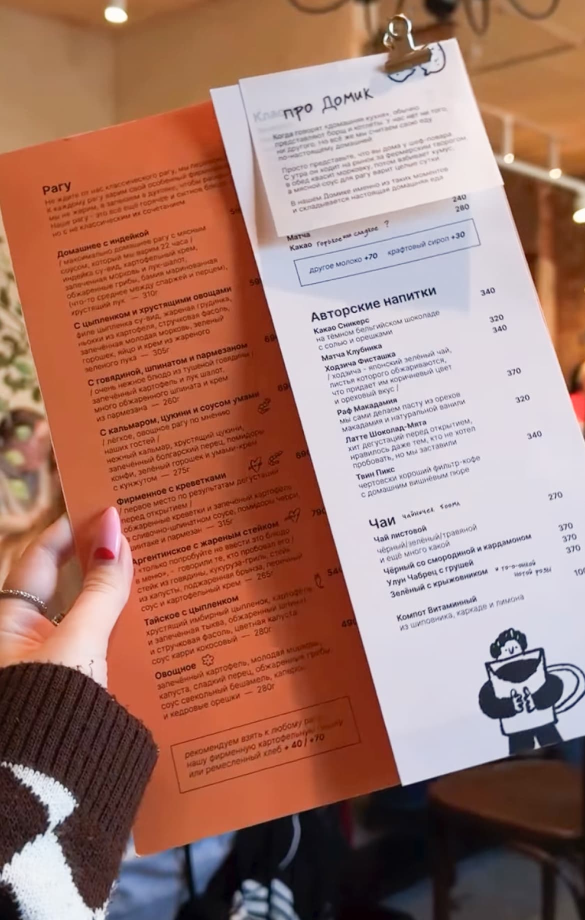
The menu consists of separate sheets held together with a clip. Handwritten details and small illustrations give it the feel of personal notes.
Any sheet can be quickly replaced if it gets damaged or the menu changes, without reprinting the whole set.
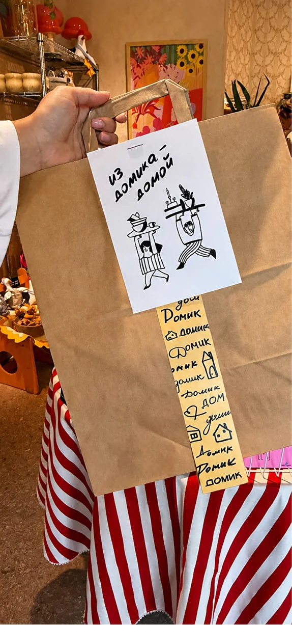
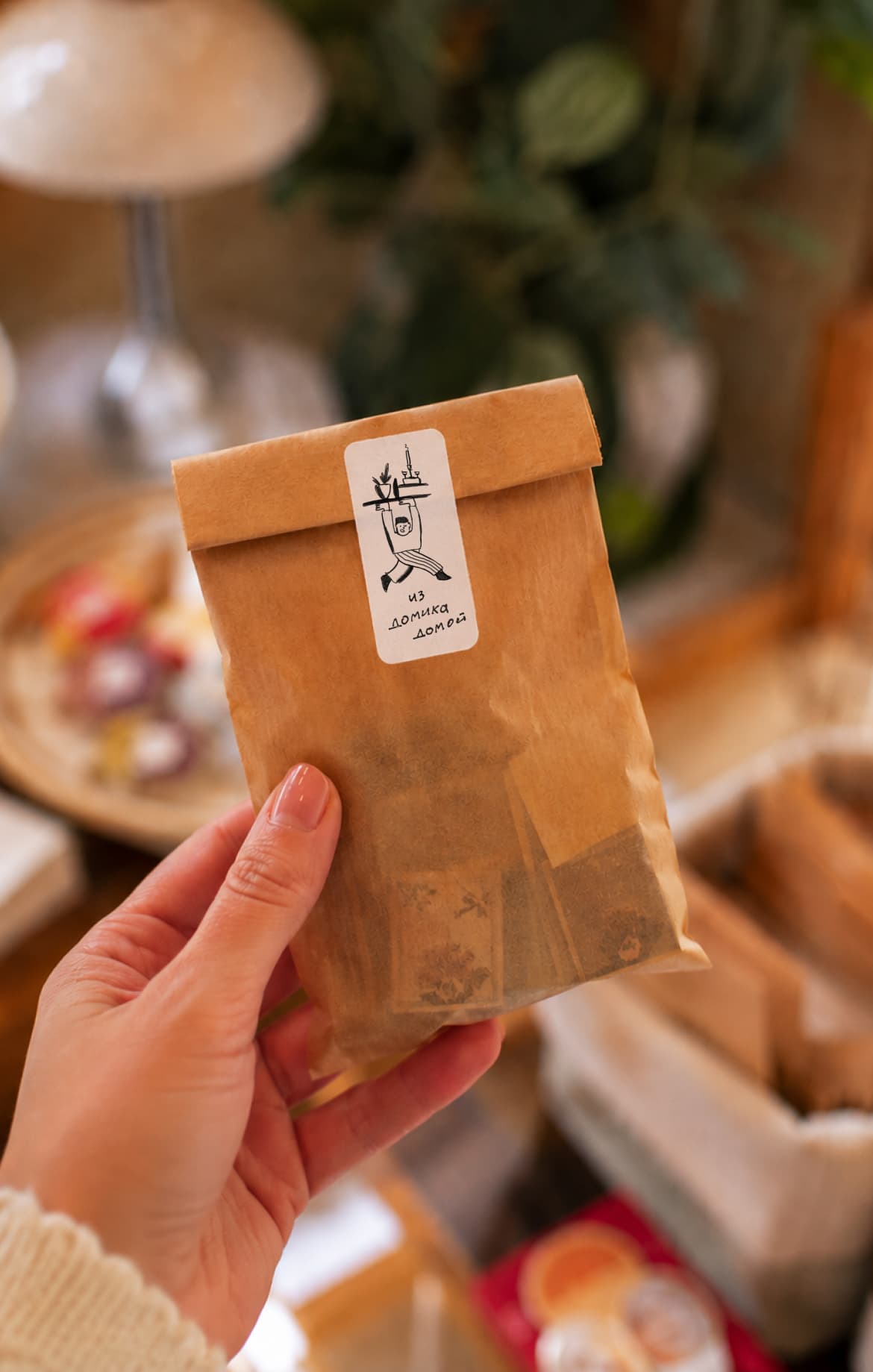
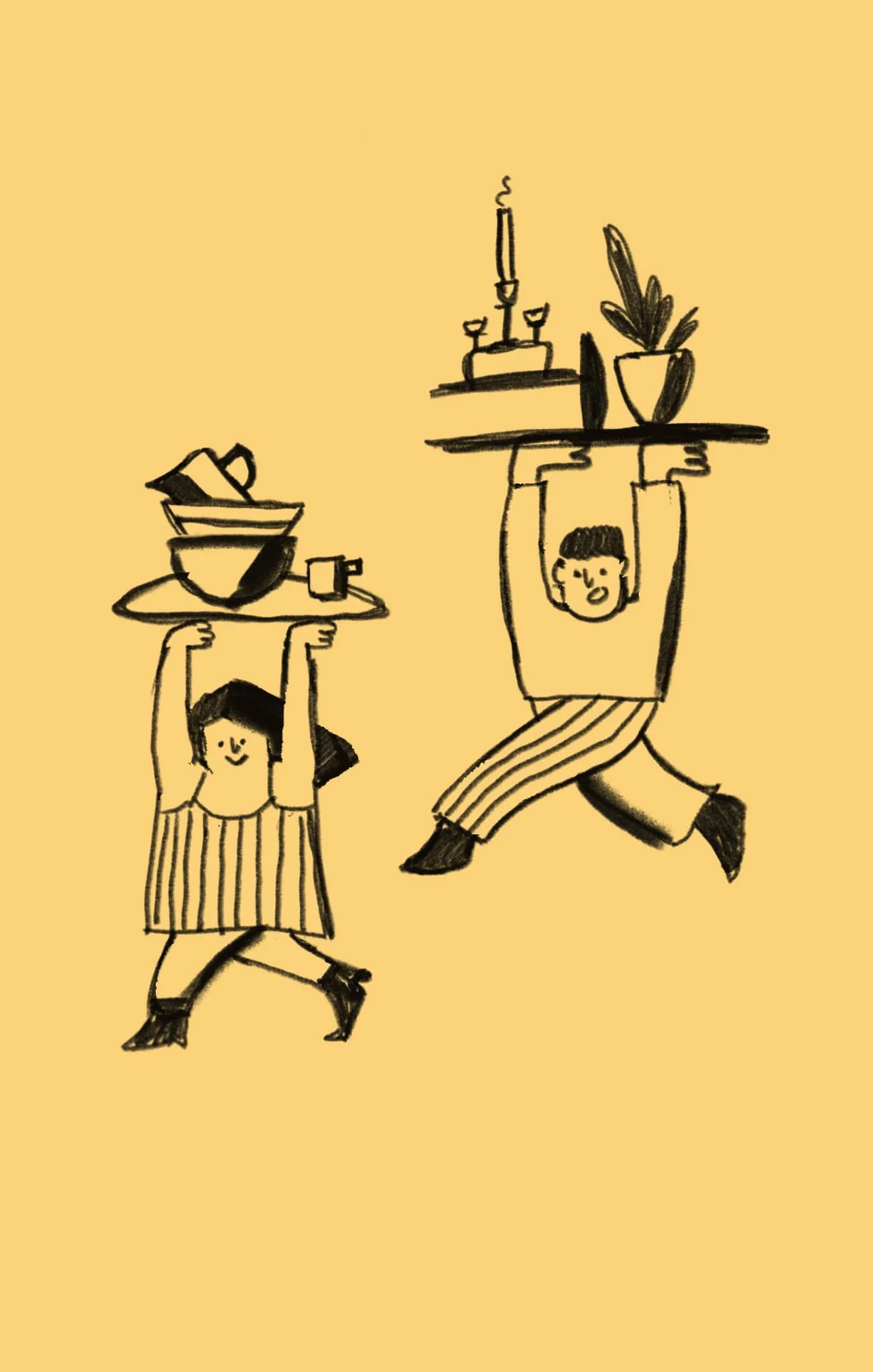
A yellow strip with handwritten lettering and a white sheet featuring illustrated characters and the phrase “From Domik to your home” are stapled to paper shopping bags in two sizes. The same characters appear on stickers for smaller purchases.
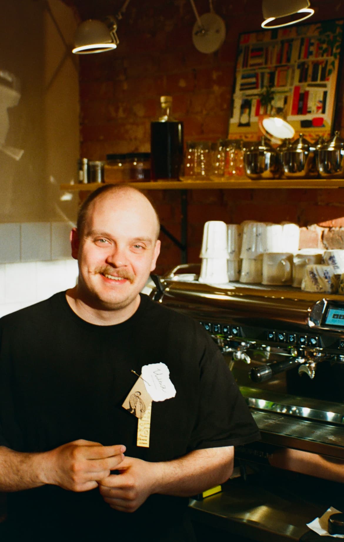
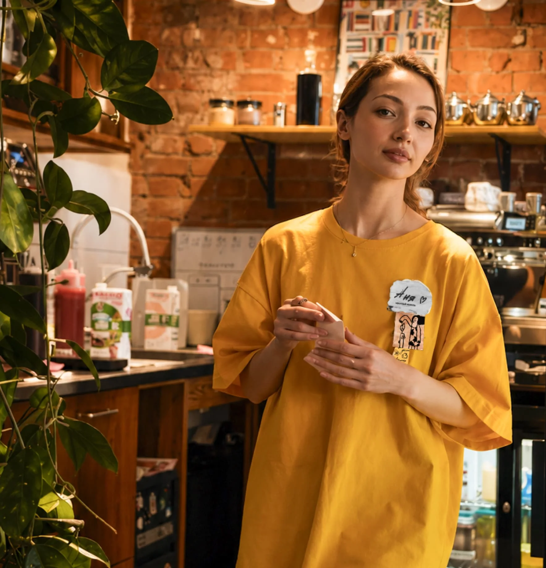
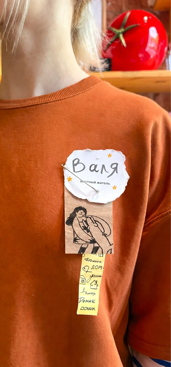
Ten characters were created for the staff badges under my direction. Each staff member chooses their character, tears off a small piece of textured paper, and writes their name in their preferred form, adding drawings if they wish. Everything is attached with a pin, together with the yellow brand strip. The shared format brings the team together, while the details leave room for individuality.


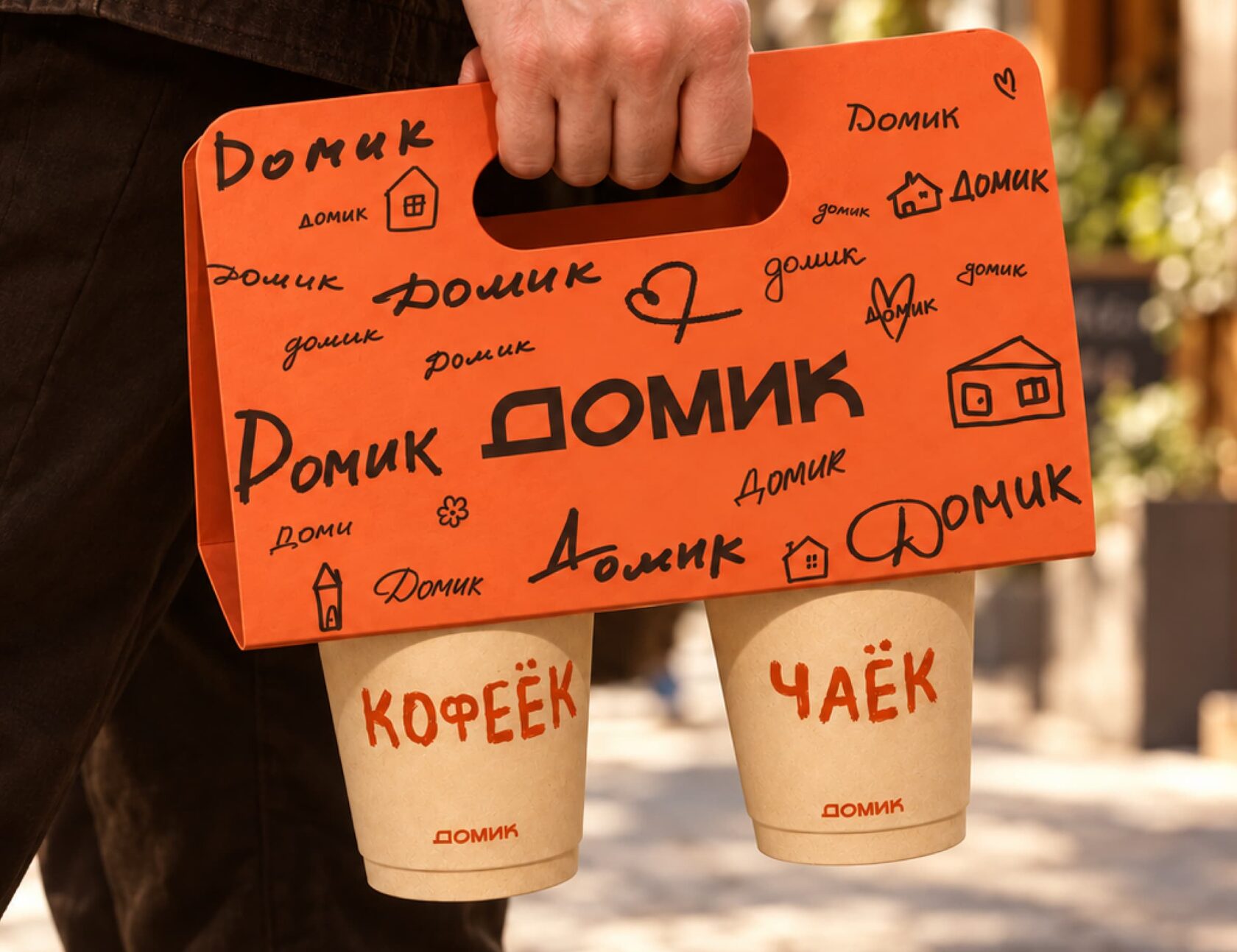
takeaway cups and carrier
brief
Design takeaway cups that reflect Domik’s character and make the brand recognisable outside the café.
idea
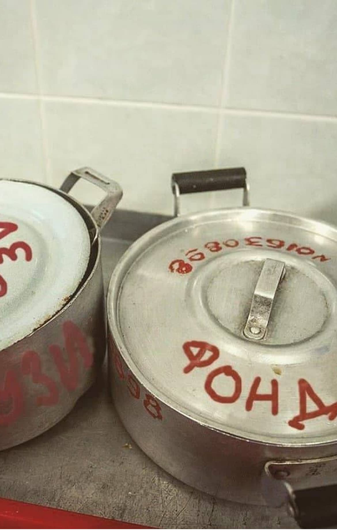
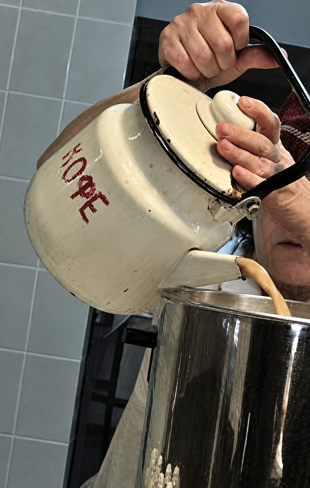
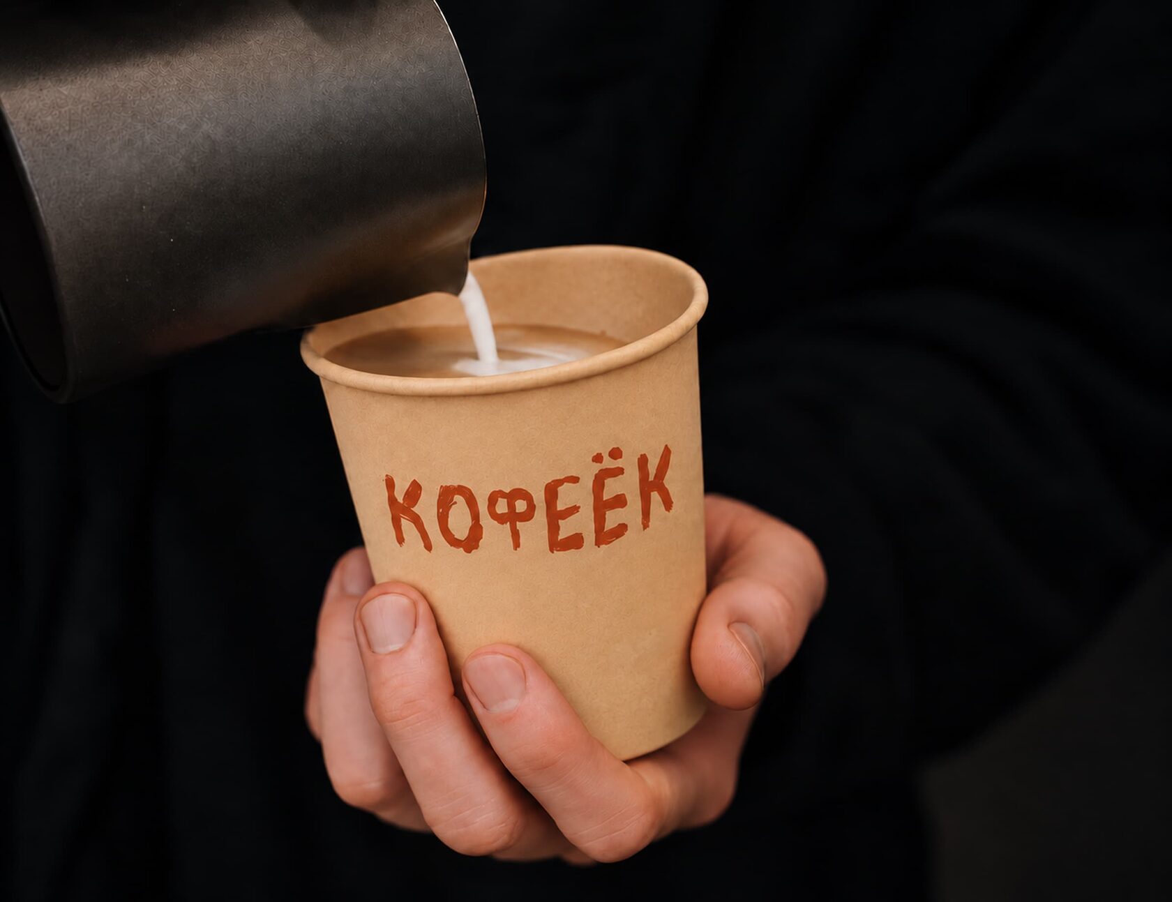
Draw inspiration from the lettering painted on tableware in Soviet canteens. Its simple, uneven style brings back memories, while “Кофеёк” — a warm, informal word for coffee — adds a homely touch.
solution
I designed the “Кофеёк” lettering to echo these painted markings. The cup has few other details, keeping the focus on the word and the shape of the letters.
The proposed two-cup carrier uses the same graphics as the packaging for purchases: handwritten “Domik” lettering and drawings of little houses. These shared elements connect the different types of packaging.
broken tableware — from
embarrassment to participation
brief
Help guests and staff feel less embarrassed or guilty when they accidentally break tableware. Find a caring response that fits Domik’s character.
idea
Turn an unfortunate accident into a contribution to a shared art piece. Each fragment represents a person and a small moment in the venue’s life. Together, they can become part of the interior.
solution
I suggested telling the person: “Don’t worry — you’ve just helped create an art piece for our interior.”
The plan is to save the fragments and give them to a craftsperson to make a decorative panel or mosaic surface. This gives the accident a new meaning: the person becomes part of a shared story, and the broken tableware finds a new purpose.
status
Concept. The final form of the art piece is still to be decided. The images are visual references.
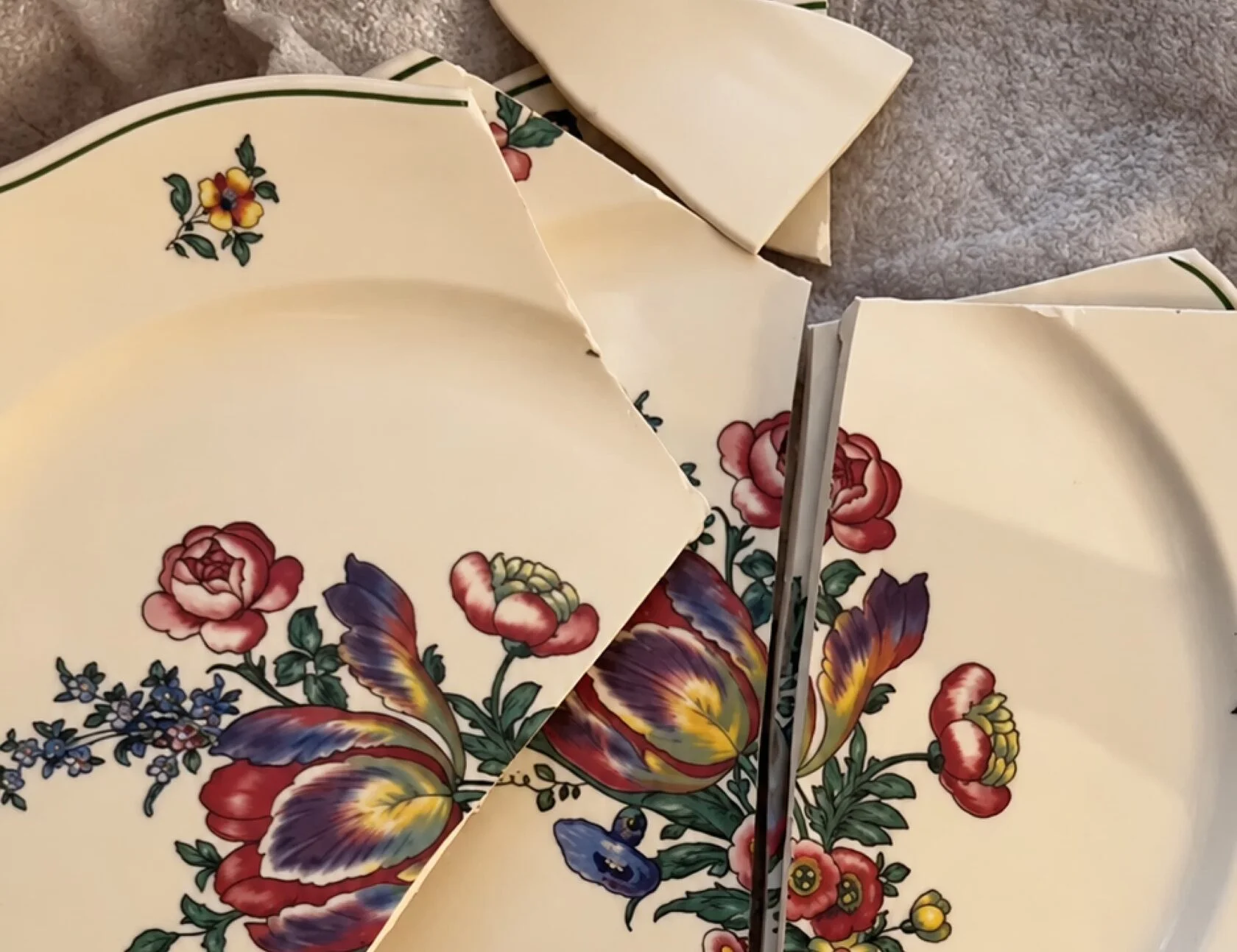
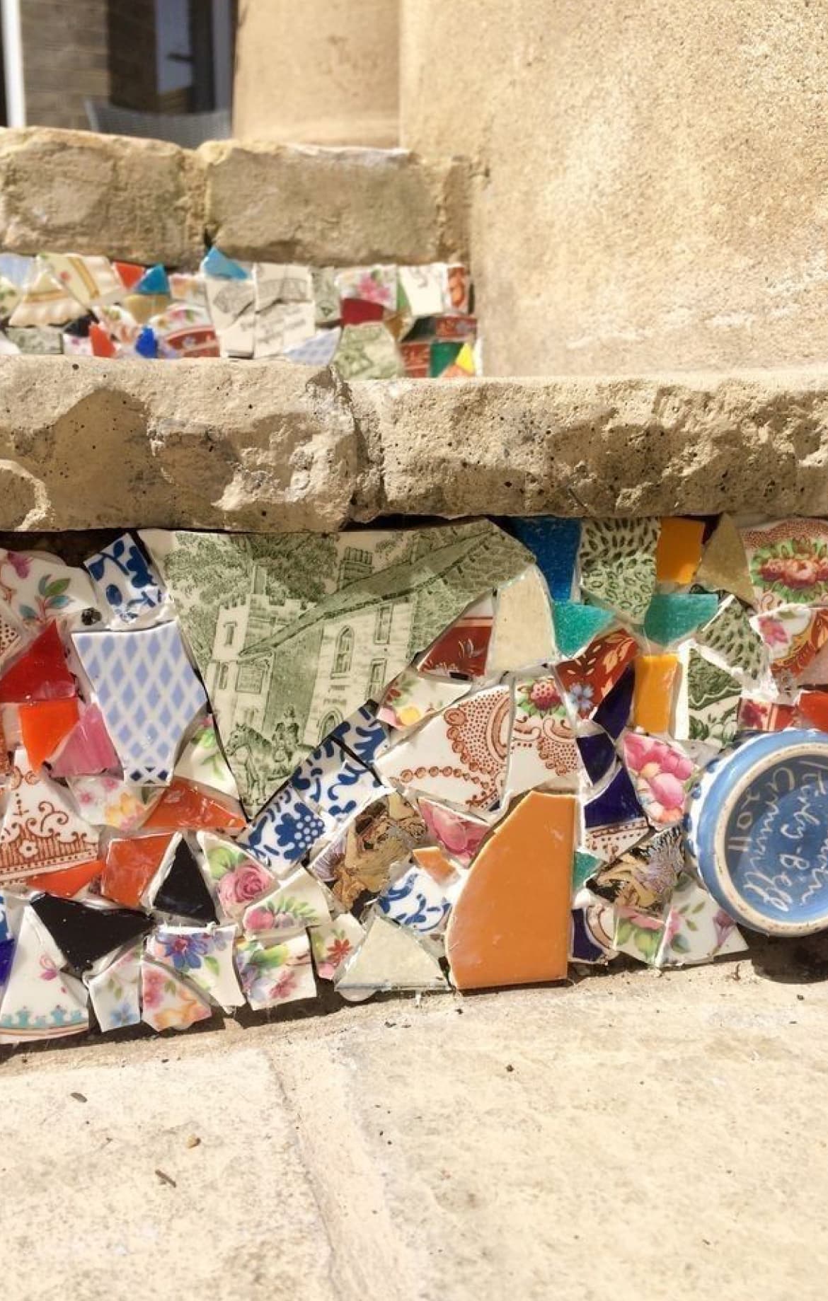
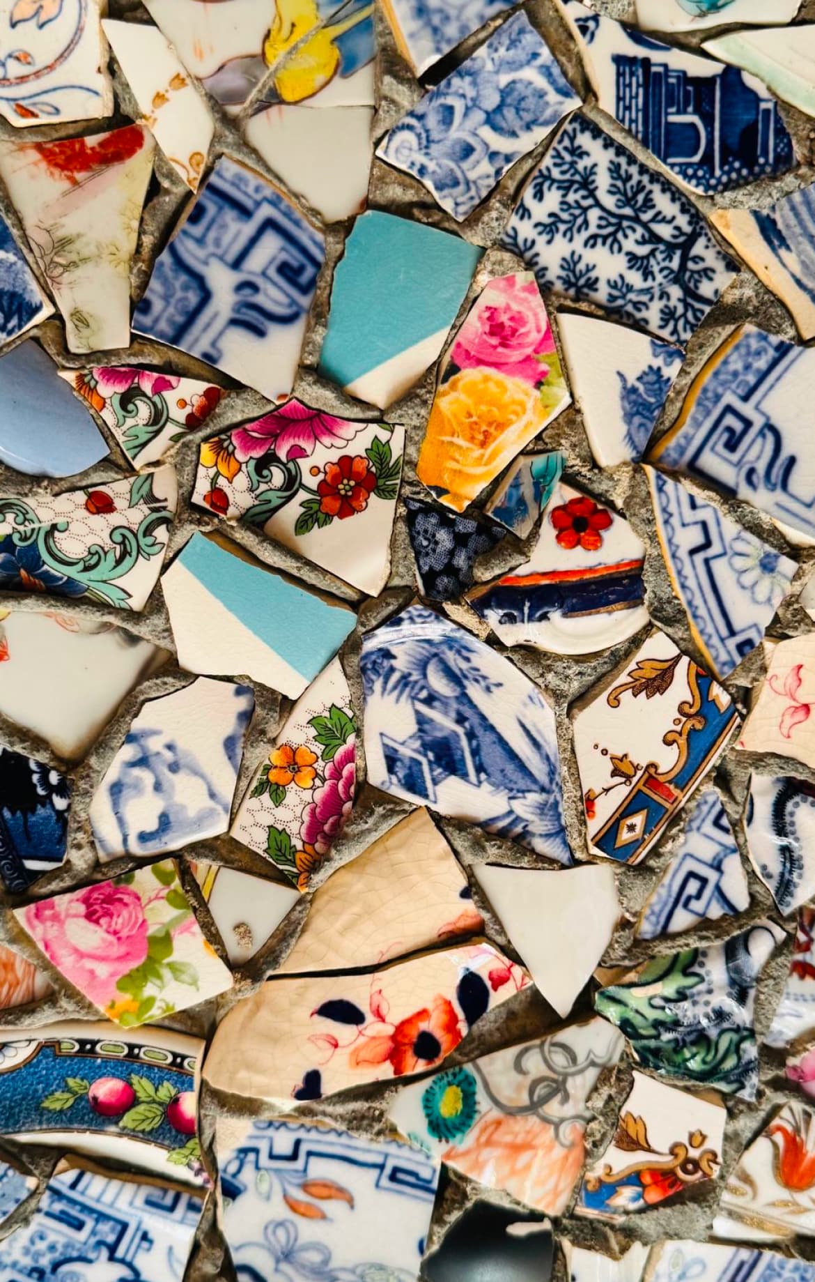
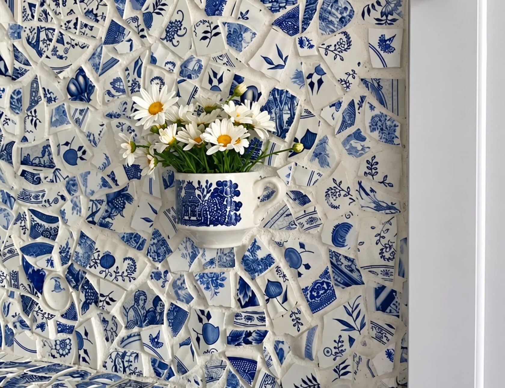
photo spot — a little house
within domik
brief
Create a photo spot inside the café that appeals to both children and adults and helps guests feel part of the space.
idea
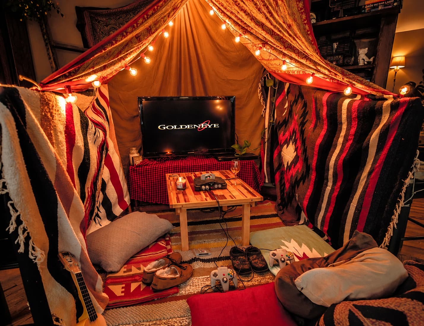
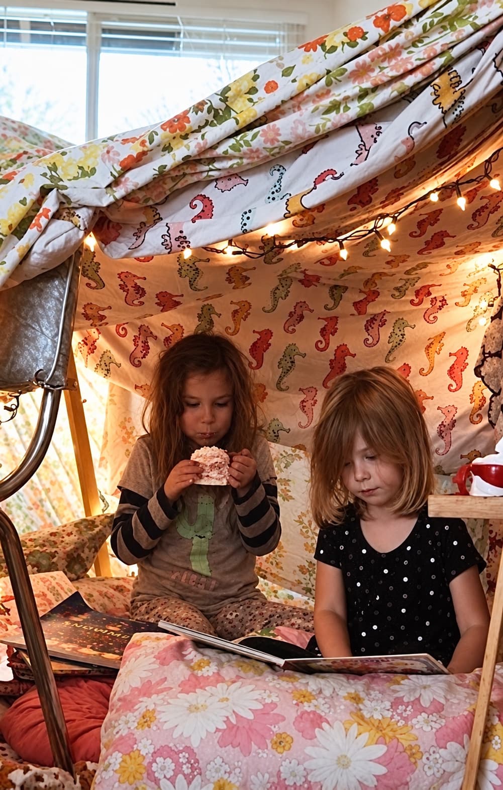
Bring back the blanket forts we built as children. Create a small shelter inside the café — a little house within Domik that invites people to peek inside and climb in.
solution
I proposed a fort made from blankets and cushions. Guests could take photos or sit inside for a while when no one else is waiting to use it.
For adults, it recalls a familiar childhood game. For children, it offers a place to explore. The experience reflects Domik’s concept and gives guests a reason to share their photos.
status
Concept. The images are visual references.